Friday, June 3, 2011

World Data Bank - Private Sector

Here's another attempt at data visualization using Tableau.

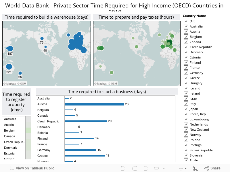
This is looking at the time required for businesses in the private sector (using data from World Bank). Specifically, I'm only looking at the 31 countries which comprise the High Income (OECD) group.

For a better view of my visualization, click here.

* You can filter on the list of countries to compare country by country.


Wednesday, June 1, 2011

The Fab Five Viz

Here's my visualization comparing five companies against each other:

1. Apple (AAPL)
2. Google (GOOG)
3. Microsoft (MSFT)
4. Oracle (ORCL)
5. SAP (SAP)

Which company looks best to you? What's the most important measure?

* Most of the numbers are in millions and span from 2001 - 2010.
* Data is taken from MSN Money Financials 10-YR SUMMARY.

Passion 2012


Still believing.